It’s not easy being a big SIL provider
It’s been a tough year for major providers. Unfortunately, they’re on the wrong end of a confluence of impacts. This means that transformation efforts are complicated because, in most cases, nearly all business functions are impacted by the NDIS cost model.
How can a QSC compliance notice lead to growth?
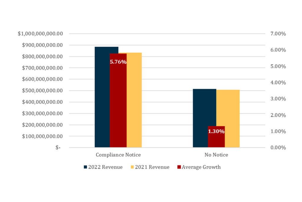
n most markets, we expect government enforcement actions to present serious risks and challenges to businesses. But, unsurprisingly and concerningly, this does not appear to be the case in the NDIS.
Board members of NDIS providers need to see these 2022 results

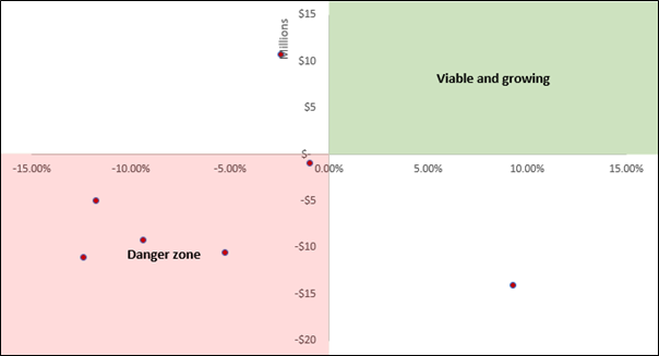
Three NDIS providers reported a combined loss of $15 million, with only one posting a minuscule 0.78% margin. These results are a far cry from the exorbitant profits we’ve seen in the media recently.
Why NDIS product strategy is almost always wrong

Let’s say your SIL business is entering the Sydney market for the first time. You will need certain inclusions, such as a robust incident management process. This process is a high-weight critical system required to perform the service. However, it is also low-variance because it varries little between competitors. Therefore, it can not serve as a point of difference. We call these inclusions table stakes.
ILO works, customers want it, so why aren’t we offering it?

Many in the NDIS have considered Individualised Living Options (ILO) as the source of community integration that the scheme initially promised.
However, the data continues to demonstrate that ILO still represents a vanishingly small amount of accommodation payments, and the growth is limited in both a rate and absolute sense. In this article, we review the ILO market from a data-driven perspective.
The big SIL providers are still struggling

This quarter, we consolidated the 2022 Supported Independent Living (SIL) data to review the performance of the biggest providers, and most are still struggling.
The state of ILO and where it is going

ILO can seem like a brilliant but distant concept for people outside of WA. There is a good reason for this. Of the ~$50,000,000 spent on ILO last year, 74% was spent in WA. This isn’t unusual, given that WA largely pioneered and operationalised the ILO model.
Where do new SIL customers come from?

Does this table suggest that in 2021-2022 Q1, only an additional 11 participants had SIL in their plans? You’re likely thinking the same thing I did – how is this possible? And our readers would know that it isn’t – we have previously reported that 327 customers entered SIL in the same period (and that was also from the NDIA).
Is the Supported Independent Living market flatlining?

The SIL market is reaching an inflection point that will change market dynamics. Our last article demonstrated that new customer growth is slowing in the SIL market. This article is number two in our SIL market series, and we will evaluate the total size of the SIL market and the implications for providers.
The one chart that explains the state of SIL

Let’s take some time to unpack this chart. We’re looking at the number of new participants entering SIL per quarter since June 2017. We’re currently at the red dot. Only 327 additional participants had SIL entered into their plan in the last quarter. Consider that the average in 2020 was 610, and the average in 2019 was 1349. Does 327 still sound like a lot of participants to you who might be interested in your service?